Identifying Anomalies in past en-route Trajectories with Clustering and Anomaly Detection Methods
Xavier Olive and Luis Basora
This notebook comes with the paper published at ATM Seminar 2019.
Details are presented in the paper. The following code is provided for
reproducibility concerns.
Data preparation
import numpy as np
from traffic.core import Traffic

t = (
    # trajectories during the opening hours of the sector
    Traffic.from_file("data/LFBBPT_flights_2017.pkl")
    .clean_invalid()
    # first cleaning and interpolation of positions when points are missing
    .resample("1s")
    # come back to 50 samples per trajectory
    .resample(50)
    # trajectory clustering needs the log of the altitude
    .assign(
        log_altitude=lambda x: x.altitude.apply(lambda x: x if x == 0 else np.log10(x))
    )
    # lazy evaluation multiprocessed on 12 cores
    .eval(max_workers=12)
)
The data has been downloaded from the OpenSky Network Impala database.
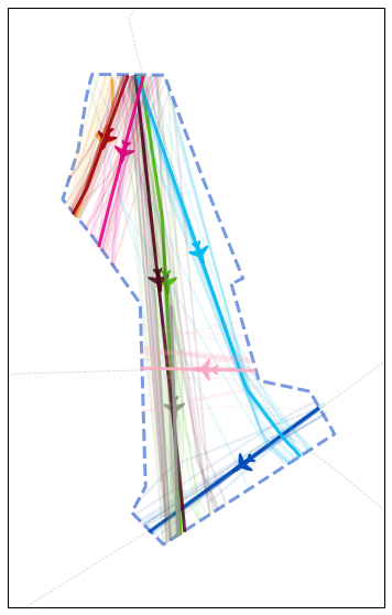
First a clustering is applied to the dataset. The implementation of the specific clustering described in the paper is available on the following github repository
from cartes.crs import Lambert93

# pip install git+https://github.com/lbasora/sectflow
from sectflow.clustering import TrajClust

features = ["x", "y", "latitude", "longitude", "altitude", "log_altitude"]
clustering = TrajClust(features)

# use the clustering API from traffic
t_cluster = t.clustering(
    nb_samples=2, features=features, projection=Lambert93(), clustering=clustering
).fit_predict(max_workers=12)
# Color distribution by cluster
from itertools import cycle, islice

n_clusters = 1 + t_cluster.data.cluster.max()
color_cycle = cycle(
    "#fbbb35 #004cb9 #4cc700 #a50016 #510420 #01bcf5 #999999 #e60085 #ffa9c5".split()
)
colors = list(islice(color_cycle, n_clusters))
colors.append("#aaaaaa")  # color for outliers, if any

import matplotlib.pyplot as plt
from random import sample

from traffic.data import airways, aixm_airspaces
from traffic.visualize.markers import rotate_marker, atc_tower, aircraft

with plt.style.context("traffic"):
    fig, ax = plt.subplots(1, figsize=(15, 10), subplot_kw=dict(projection=Lambert93()))

    aixm_airspaces["LFBBPT"].plot(
        ax, linewidth=3, linestyle="dashed", color="steelblue"
    )
    for name in "UN460 UN869 UM728".split():
        airways[name].plot(ax, linestyle="dashed", color="#aaaaaa")

    # do not plot outliers
    for cluster in range(n_clusters):

        current_cluster = t_cluster.query(f"cluster == {cluster}")

        # plot the centroid of each cluster
        centroid = current_cluster.centroid(50, projection=Lambert93())
        centroid.plot(ax, color=colors[cluster], alpha=0.9, linewidth=3)
        centroid_mark = centroid.at_ratio(0.45)

        # little aircraft
        centroid_mark.plot(
            ax,
            color=colors[cluster],
            marker=rotate_marker(aircraft, centroid_mark.track),
            s=500,
            text_kw=dict(s=""),  # no text associated
        )

        # plot some sample flights from each cluster
        sample_size = min(20, len(current_cluster))
        for flight_id in sample(current_cluster.flight_ids, sample_size):
            current_cluster[flight_id].plot(
                ax, color=colors[cluster], alpha=0.1, linewidth=2
            )

    # TODO improve this: extent with buffer
    ax.set_extent(
        tuple(
            x - 0.5 + (0 if i % 2 == 0 else 1)
            for i, x in enumerate(aixm_airspaces["LFBBPT"].extent)
        )
    )

    # Equivalent of Fig. 5
Machine-Learning
The anomaly detection method is based on a stacked autoencoder (PyTorch implementation).
import torch
from torch import nn, optim, from_numpy, rand
from torch.autograd import Variable
from sklearn.preprocessing import minmax_scale
from tqdm.autonotebook import tqdm
# Stacked autoencoder
class Autoencoder(nn.Module):
def __init__(self):
super().__init__()
self.encoder = nn.Sequential(
nn.Linear(50, 24), nn.ReLU(), nn.Linear(24, 12), nn.ReLU()
)
self.decoder = nn.Sequential(
nn.Linear(12, 24), nn.ReLU(), nn.Linear(24, 50), nn.Sigmoid()
)
def forward(self, x, **kwargs):
x = x + (rand(50).cuda() - 0.5) * 1e-3 # add some noise
x = self.encoder(x)
x = self.decoder(x)
return x
# Regularisation term introduced in IV.B.2
def regularisation_term(X, n):
samples = torch.linspace(0, X.max(), 100, requires_grad=True)
mean = samples.mean()
return torch.relu(
(torch.histc(X) / n * 100 - 1 / mean * torch.exp(-samples / mean))
).mean()
# ML part
def anomalies(t: Traffic, cluster_id: int, lambda_r: float, nb_it: int = 10000):
t_id = t.query(f"cluster=={cluster_id}")
flight_ids = list(f.flight_id for f in t_id)
n = len(flight_ids)
X = minmax_scale(np.vstack(f.data.track[:50] for f in t_id))
model = Autoencoder().cuda()
criterion = nn.MSELoss()
optimizer = optim.Adam(model.parameters(), lr=1e-3, weight_decay=1e-5)
for epoch in tqdm(range(nb_it), leave=False):
v = Variable(from_numpy(X.astype(np.float32))).cuda()
output = model(v)
distance = nn.MSELoss(reduction="none")(output, v).sum(1).sqrt()
loss = criterion(output, v)
# regularisation
loss = (
lambda_r * regularisation_term(distance.cpu().detach(), n)
+ criterion(output, v).cpu()
)
optimizer.zero_grad()
loss.backward()
optimizer.step()
output = model(v)
return (
(nn.MSELoss(reduction="none")(output, v).sum(1)).sqrt().cpu().detach().numpy()
)
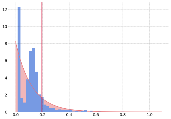
# no regularisation for this plot
output = anomalies(t_cluster, 3, lambda_r=0, nb_it=3000)
The following code plots the distribution of reconstruction errors without
regularisation, resulting in two modes in the distribution. The lambda_r
parameter helps reducing this trend.
from scipy.stats import expon

# Equivalent of Fig. 4

with plt.style.context("traffic"):
    fig, ax = plt.subplots(1, figsize=(10, 7))
    hst = ax.hist(output, bins=50, density=True)
    mean = output.mean()
    x = np.arange(0, output.max(), 1e-2)
    e = expon.pdf(x, 0, output.mean())

    ax.plot(x, e, color="#e77074")
    ax.fill_between(x, e, zorder=-2, color="#e77074", alpha=0.5)
    ax.axvline(
        output.mean() * np.log(5), color="crimson", linestyle="solid", linewidth=3
    )