How to implement trajectory clustering?
An API for trajectory clustering is provided in the Traffic class. Regular clustering methods from scikit-learn can be passed as parameters, or any object implementing the fit(), predict() and fit_predict() methods (see ClusterMixin.)
Data is prepared to match the input format of these methods, preprocessed with
transformers (see TransformerMixin),
e.g. MinMaxScaler() or StandardScaler(), and the result of the clustering is
added to the Traffic DataFrame as a new cluster feature.
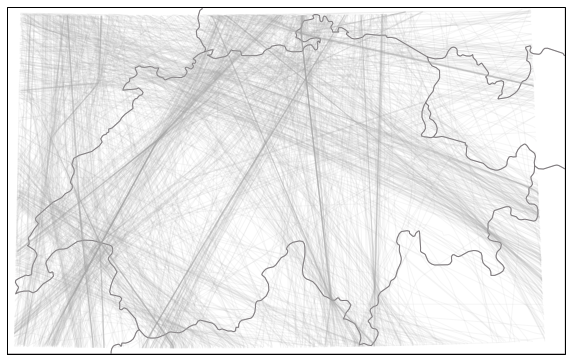
The following illustrates the usage of the API on a sample dataset of traffic over Switzerland. The dataset contains flight trajectories over Switzerland on August 1st 2018, cleaned and resampled to one point every five seconds. The data is available as a basic import:
# see https://traffic-viz.github.io/samples.html if any issue on import
from traffic.data.samples import switzerland
The full dataset of trajectories can be displayed on a basic Switzerland map.
import matplotlib.pyplot as plt

from cartes.crs import CH1903
from cartes.utils.features import countries

with plt.style.context("traffic"):
    ax = plt.axes(projection=CH1903())
    ax.add_feature(countries())
    switzerland.plot(ax, alpha=0.1)
It is often relevant to use the track angle when doing clustering on trajectories as it helps separating close trajectory flows heading in opposite directions. However a track angle may be problematic when crossing the 360°/0° (or -180°/180°) line.
Flight.unwrap() is probably the most relevant method to apply:
t_unwrapped = switzerland.assign_id().unwrap().eval(max_workers=4)
The following snippet projects trajectories to a local projection, resample each trajectory to 15 sample points, apply scikit-learn’s StandardScaler() before calling a DBSCAN.fit_predict() method.
If a fitted DBSCAN instance is passed in parameter, the predict() method can be called on new data.
from sklearn.cluster import DBSCAN
from sklearn.preprocessing import StandardScaler
from cartes.crs import CH1903

t_dbscan = t_unwrapped.clustering(
    nb_samples=15,
    projection=CH1903(),
    features=["x", "y", "track_unwrapped"],
    clustering=DBSCAN(eps=0.5, min_samples=10),
    transform=StandardScaler(),
).fit_predict()
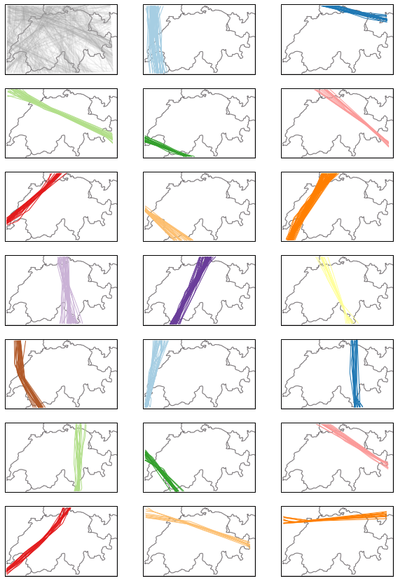
>>> dict(t_dbscan.groupby(["cluster"]).agg({"flight_id": "nunique"}).flight_id)

{-1: 685, 0: 62, 1: 30, 2: 23, 3: 17, 4: 14, 5: 25, 6: 24, 7: 70, 8: 49, 9: 53,
 10: 15, 11: 24, 12: 30, 13: 19, 14: 23, 15: 25, 16: 19, 17: 16, 18: 10, 19: 11}
The above distribution results from the DBSCAN prediction. We can compare the results with a Gaussian Mixture model for example. This model must be initialized with a number of components. We chose here 19 components to compare them with the result of the DBSCAN algorithm.
from sklearn.mixture import GaussianMixture

t_gmm = t_unwrapped.clustering(
    nb_samples=15,
    projection=CH1903(),
    features=["x", "y", "track_unwrapped"],
    clustering=GaussianMixture(n_components=19),
    transform=StandardScaler(),
).fit_predict()
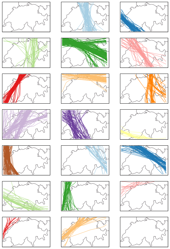
>>> dict(t_gmm.groupby(["cluster"]).agg({"flight_id": "nunique"}).flight_id)

{0: 94, 1: 76, 2: 46, 3: 145, 4: 47, 5: 89, 6: 76, 7: 50, 8: 143, 9: 57,
 10: 31, 11: 108, 12: 35, 13: 75, 14: 35, 15: 55, 16: 12, 17: 13, 18: 57}
The following snippets visualises each trajectory cluster with a given color. Many outliers appear in shaded grey in the first quartet.
from itertools import islice, cycle

from cartes.utils.features import countries

n_clusters = 1 + t_dbscan.data.cluster.max()

# -- dealing with colours --

color_cycle = cycle(
    "#a6cee3 #1f78b4 #b2df8a #33a02c #fb9a99 #e31a1c "
    "#fdbf6f #ff7f00 #cab2d6 #6a3d9a #ffff99 #b15928".split()
)
colors = list(islice(color_cycle, n_clusters))
colors.append("#aaaaaa")  # color for outliers, if any

# -- dealing with the grid --

nb_cols = 3
nb_lines = (1 + n_clusters) // nb_cols + (((1 + n_clusters) % nb_cols) > 0)

with plt.style.context("traffic"):

    fig, ax = plt.subplots(
        nb_lines, nb_cols, figsize=(10, 15), subplot_kw=dict(projection=CH1903())
    )

    for cluster in range(-1, n_clusters):
        ax_ = ax[(cluster + 1) // nb_cols][(cluster + 1) % nb_cols]
        ax_.add_feature(countries())

        t_dbscan.query(f"cluster == {cluster}").plot(
            ax_, color=colors[cluster], alpha=0.1 if cluster == -1 else 1
        )
        ax_.set_global()
Gaussian Mixtures do not yield any outlier. The following clustering is balanced differently.
with plt.style.context("traffic"):

    fig, ax = plt.subplots(
        nb_lines, nb_cols, figsize=(10, 15), subplot_kw=dict(projection=CH1903())
    )

    for cluster in range(-1, n_clusters):
        ax_ = ax[(cluster + 1) // nb_cols][(cluster + 1) % nb_cols]
        ax_.add_feature(countries())

        t_gmm.query(f"cluster == {cluster}").plot(
            ax_, color=colors[cluster], alpha=0.1 if cluster == -1 else 1
        )
        ax_.set_global()
The following map demonstrates how to use the Traffic.centroid() method, computed with the same parameters as the clustering.
from random import sample

from cartes.crs import CH1903
from cartes.utils.features import countries, lakes
from traffic.data import airports, airways, navaids
from traffic.visualize.markers import rotate_marker, atc_tower, aircraft

with plt.style.context("traffic"):
    fig, ax = plt.subplots(1, figsize=(15, 10), subplot_kw=dict(projection=CH1903()))
    ax.add_feature(countries(facecolor="#dedef4", linewidth=2))
    ax.add_feature(lakes())

    for cluster in range(n_clusters):

        current_cluster = t_dbscan.query(f"cluster == {cluster}")
        centroid = current_cluster.centroid(15, projection=CH1903())
        centroid.plot(ax, color=colors[cluster], alpha=0.9, linewidth=3)
        centroid_mark = centroid.at_ratio(0.45)

        centroid_mark.plot(
            ax,
            color=colors[cluster],
            marker=rotate_marker(aircraft, centroid_mark.track),
            s=500,
            text_kw=dict(s=""),  # no text associated
        )
        sample_size = min(20, len(current_cluster))

        for flight_id in sample(current_cluster.flight_ids, sample_size):
            current_cluster[flight_id].plot(
                ax, color=colors[cluster], alpha=0.1, linewidth=2
            )

    swiss_airways = airways.extent("Switzerland")
    for (
        name
    ) in "UL613 UL856 UM729 UN491 UN850 UN851 UN853 UN869 UN871 UQ341 Z50".split():
        swiss_airways[name].plot(ax, color="#34013f")

    for name in "BSL GVA ZRH".split():
        bbox = dict(
            facecolor="lightgray", edgecolor="none", alpha=0.6, boxstyle="round"
        )
        airports[name].point.plot(ax, marker=atc_tower, s=500, zorder=5)

    swiss_navaids = navaids.extent("Switzerland")
    for name in (
        "ABESI BENOT DEGES DITON ELMUR GERSA HOC MOLUS ODINA OLBEN "
        "ORSUD RESIA ROLSA ROMIR RONAG SOPER SUREP TRA".split()
    ):
        swiss_navaids[name].plot(ax, marker="^", color="#34013f")

    ax.set_global()
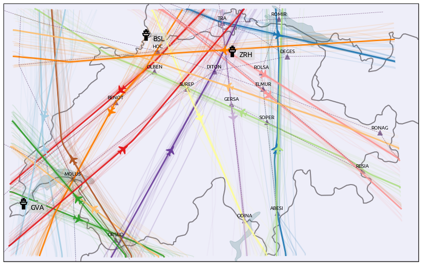
The result may be compared to the Blick newspaper great visualisation by Simon Huwiler and Priska Wallimann here. (github repository)