Flight density heatmaps
(contribution by Simon Proud @simon_sat)
Heatmaps are a convenient way to visualise information on a map. Common applications are related to aviation include visualisation of temperatures, thunderstorm activities, turbulence, and traffic density.
The traffic library provides a fast (a pandas implementation) and comfortable way to aggregate data into a structure which can easily be plotted on maps.
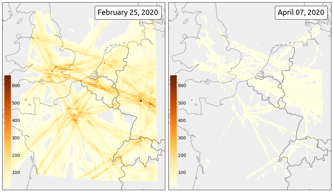
The COVID-19 situation is a perfect use case to demonstrate how to make flight density visualisations, before and after the crisis.
You will find below the code producing the following maps.
First download the data from the Impala shell over your area of interest (ground trajectories are kept out of the dataset).
from traffic.data import opensky

# Setting up the start and end times for the retrieval
# This one is the pre-crisis day
pre_day = "2020-02-25"

# This one is the post-crisis day
post_day = "2020-04-07"

# This bounding box covers Western Europe (4 major airports)
# lon0, lat0, lon1, lat1
bounds = [-3, 45., 10., 55.]

pre_data = opensky.history(
    start=pre_day,
    bounds=bounds,
    other_params=" and onground=false "
)

post_data = opensky.history(
    start=post_day,
    bounds=bounds,
    other_params=" and onground=false "
)

# Saving data (optional)

pre_data.to_pickle("2020-02-25_extended_muac.pkl")
post_data.to_pickle("2020-04-07_extended_muac.pkl")
The data preparation including removing invalid data (a set of convenient heuristics which do the job in most situations), assigning a different id to all trajectory legs, applying default cascade filters, and resampling the data to one point per second.
Note that it is always a good practice to resample trajectories as the operation includes heuristics to remove abnormal and inconsistent timestamps.
before_covid19 = (
    pre_data.clean_invalid()
    .assign_id()  # helps counting the number of flight rather than aircraft
    .filter()  # filter abnormal values
    .resample("10s")  # we don't need so many points for a heatmap
    .eval(desc="", max_workers=4)  # multiprocessed (watch your RAM usage!)
)

after_covid19 = (
    post_data.clean_invalid()
    .assign_id()
    .filter()
    .resample("10s")
    .eval(desc="", max_workers=4)
)

# Saving data (optional)

before_covid19.to_pickle("before_covid19.pkl")
after_covid19.to_pickle("after_covid19.pkl")
The .agg_latlon() methods returns a pandas DataFrame indexed by rounded latitude and longitude values. .to_xarray() require the xarray library (to be installed separately) which provides proper plot methods to add the heatmap to the maps.
import matplotlib.pyplot as plt

from matplotlib.offsetbox import AnchoredText
from mpl_toolkits.axes_grid1.inset_locator import inset_axes

from cartopy.crs import EuroPP, PlateCarree
from cartes.utils.features import countries, ocean


with plt.style.context("traffic"):

    fig = plt.figure(figsize=(15, 10), frameon=False)
    ax = fig.subplots(1, 2, subplot_kw=dict(projection=EuroPP()))

    for ax_ in ax:
        ax_.add_feature(countries(scale="50m", linewidth=1.5))
        ax_.background_patch.set_facecolor("#eeeeee")

    vmax = None  # this trick will keep the same colorbar scale for both maps

    for i, data in enumerate([before_covid19, after_covid19]):
        cax = (
            data.query("altitude > 10000")
            .agg_latlon(
                # 10 points per integer lat/lon
                resolution=dict(latitude=10, longitude=10),
                # count the number of flights
                flight_id="nunique"
            ).query(f"flight_id > 10")  # do not display outlier flights
            .to_xarray()
            .flight_id.plot.pcolormesh(
                ax=ax[i],
                cmap="YlOrBr",
                transform=PlateCarree(),
                vmax=vmax,
                add_colorbar=False,
            )
        )

        cbaxes = inset_axes(ax[i], "4%", "60%", loc=3)
        cb = fig.colorbar(cax, cax=cbaxes)

        # keep this value to scale the colorbar for the second day
        vmax = cb.vmax

        text = AnchoredText(
            f"{data.start_time:%B %d, %Y}",
            loc=1,
            prop={"size": 24, "fontname": "Ubuntu"},
            frameon=True,
        )
        text.patch.set_boxstyle("round,pad=0.,rounding_size=0.2")
        ax[i].add_artist(text)

    fig.set_tight_layout(True)